 I've added a quote onto my advert to catch the readers eye. Most adverts that I've looked at all included a tag line, and were kept quite simple so that's why I decided to do. I cropped and desaturated my image on Google. I decided to do an advert just focusing on a amplifier because my magazine has a focus on the quality of music rather than the actual people.
Tuesday, 8 March 2011
Final Advert
 I've added a quote onto my advert to catch the readers eye. Most adverts that I've looked at all included a tag line, and were kept quite simple so that's why I decided to do. I cropped and desaturated my image on Google. I decided to do an advert just focusing on a amplifier because my magazine has a focus on the quality of music rather than the actual people.
Advert
Thursday, 3 March 2011
Edited Front Cover Picture

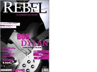
What I did to my picture is I made a copy and in layor 0 I added a lense flare, so that it would look like a spotlight so that the singer was at a gig. I desaturated the image and turned up the brightness and contrast. I wanted the focus to be on the guitar as the image for my magazine is meant to be classy, and more about the quality of music. This guy is meant to be Bob Dylan and because the music he produces is quality, thats why the focus is on the guitar and it doesnt show his head. Also you can tell this by the tagline on the front cover under the name Bob Dylan it says 'the mystery'.
Subscribe to:
Comments (Atom)

