Tuesday, 1 May 2012
Tuesday, 20 March 2012
Tuesday, 28 February 2012
Final - digipak album cover & back


I've contrasted the red and white strongly in this photo as I believe it makes the image stand out and look a lot more creepy. The reason why I picked this photo opposed to others is because it fits the whole front of the album cover, and there is no blank spaces and that is what I wanted and imagined my album cover to look like. Also the eyes are staring straight at the audience, which directly addresses them. The face is also looking straight at it's audience, and I believe that connatates to the what makes a stalker, (they are in control). Again I've used a font which looks like text that's been ripped out of a newspaper, again adding to the effects of a stalker. I've also created the back of the cd, keeping the style and genre the same.
Monday, 27 February 2012
Final Magazine Advertisment
 This is my final magazine advertisement, it fits into the typical genre of 'punk'. It looks fun and cartoon like. I chose red because it's bold, it's a typical punk colour, and it's a typical clown colour. The font that the bands name is written in 'The Richard Heads' looks like it's been ripped out of a newspaper, which links in with the album name Stalker, because that's how they stereotypically write their ransoms. There was two different ways in which I could of gone when creating my magazine advert, I could of promoted a tour but I decided to promote their single instead. Previously I have practised creating posters in the 'typical' style of the punk genre and eventually came to my final idea, which is the poster above. I believe this advertisement stands out because of the image, it's an image that sticks in your head because of its creepiness. This advert would appear in alternative magazines such as Kerrang, or Mojo as it fits the genre, and suits the genre of other bands that are already being promoted. I have kept the advert quite simple, getting straight to the point, mentioning only what needs to be said as I didn't want to over crowd the poster. I didn't want to ruin the image as I believe it leaves some sort of curiosity that makes you want to find out what the songs about, even though it is quite self explanatory. I think that you can tell by the poster that this band is a British one, as the punk genre resembles British history, and it also looks like a band which like to have fun with their music and not take themselves to seriously, whereas the stereotypical view on American music is that they take themselves a lot more seriously. I think that this poster portrays the message that the band I'm promoting is a punk band successfully through the image.
Photos for my final advertisment & cd album cover

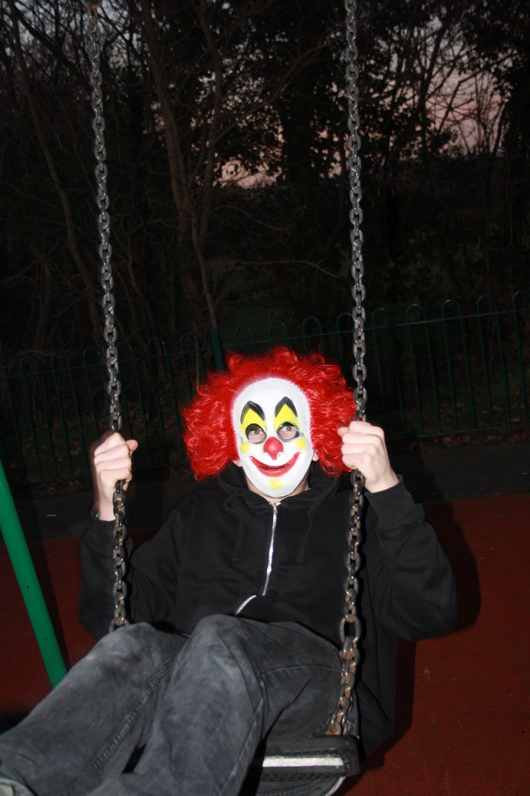
 Me and a member 0f my group went out and took these photos for our final pictures. In our video it's about a man in a mask, so that's why we've taken these pictures as it all links in together. The song is about a stalker, disgused in a clown mask, so the purpose of these images is to look quite 'creepy'.


Tuesday, 7 February 2012
magazine advertisement

This is one of the magazine advertisements that I created. I wanted it to look abstract just like the Queens of the Stoneage album that I looked at. Most adverts have exactly the same image on the album as it makes it more recognizable if you went and actually bought the album. You don't need to include much on the advertisements as some of them can tend to look overcrowded, so I've just put on the basics of what you need to know; the formats you can receive the album in, the date that it's out, and the actual band that it is.
Subscribe to:
Comments (Atom)