Tuesday, 1 May 2012

Tuesday, 20 March 2012
Tuesday, 28 February 2012
Final - digipak album cover & back


I've contrasted the red and white strongly in this photo as I believe it makes the image stand out and look a lot more creepy. The reason why I picked this photo opposed to others is because it fits the whole front of the album cover, and there is no blank spaces and that is what I wanted and imagined my album cover to look like. Also the eyes are staring straight at the audience, which directly addresses them. The face is also looking straight at it's audience, and I believe that connatates to the what makes a stalker, (they are in control). Again I've used a font which looks like text that's been ripped out of a newspaper, again adding to the effects of a stalker. I've also created the back of the cd, keeping the style and genre the same.
Monday, 27 February 2012
Final Magazine Advertisment
 This is my final magazine advertisement, it fits into the typical genre of 'punk'. It looks fun and cartoon like. I chose red because it's bold, it's a typical punk colour, and it's a typical clown colour. The font that the bands name is written in 'The Richard Heads' looks like it's been ripped out of a newspaper, which links in with the album name Stalker, because that's how they stereotypically write their ransoms. There was two different ways in which I could of gone when creating my magazine advert, I could of promoted a tour but I decided to promote their single instead. Previously I have practised creating posters in the 'typical' style of the punk genre and eventually came to my final idea, which is the poster above. I believe this advertisement stands out because of the image, it's an image that sticks in your head because of its creepiness. This advert would appear in alternative magazines such as Kerrang, or Mojo as it fits the genre, and suits the genre of other bands that are already being promoted. I have kept the advert quite simple, getting straight to the point, mentioning only what needs to be said as I didn't want to over crowd the poster. I didn't want to ruin the image as I believe it leaves some sort of curiosity that makes you want to find out what the songs about, even though it is quite self explanatory. I think that you can tell by the poster that this band is a British one, as the punk genre resembles British history, and it also looks like a band which like to have fun with their music and not take themselves to seriously, whereas the stereotypical view on American music is that they take themselves a lot more seriously. I think that this poster portrays the message that the band I'm promoting is a punk band successfully through the image.
Photos for my final advertisment & cd album cover

 Me and a member 0f my group went out and took these photos for our final pictures. In our video it's about a man in a mask, so that's why we've taken these pictures as it all links in together. The song is about a stalker, disgused in a clown mask, so the purpose of these images is to look quite 'creepy'.







Tuesday, 7 February 2012
magazine advertisement

This is one of the magazine advertisements that I created. I wanted it to look abstract just like the Queens of the Stoneage album that I looked at. Most adverts have exactly the same image on the album as it makes it more recognizable if you went and actually bought the album. You don't need to include much on the advertisements as some of them can tend to look overcrowded, so I've just put on the basics of what you need to know; the formats you can receive the album in, the date that it's out, and the actual band that it is.
Photos


These are the photos that I took for my cd cover and film poster. I wanted them to be against a brick wall. I had to take a few so that I could try out different techniques when creating my film poster. A lot of punk album covers that I looked at used something completly unrelatable to the band. A lot of the time its a girl, presented in an abstract type way, so that's what I'm going to try.


Tuesday, 17 January 2012
CD Digipak & advertisment Idea.

For my idea I want to create quite a surrealist cartoon like image, just like this album by Eagles of Death Metal. I was thinking of taking a photo of a grungy looking girl, and with the help of photshop it will hopefully turn out to look something like this. The typical dress idea would be fishnets, furry jacket, small dress and doc Martins. I would use the same image on my advert, but on a larger scale.
Tuesday, 22 November 2011
Questionnaire
Me and my group decided to do a short questionaire to see what type of music people our age listen to. We came to the conclusion that it was alternative indie rock, luckily the video that we decided to shoot was simialr of that style.
Digipak Layouts
 All digipak styles tend to be quite similar, as in you open it up and the cd is inside, but some of them have little twists like this Oasis album. Layouts such as this one, make it more interesting for the audience to look at. It includes extra things that the audience can look at, whether that be pictures of the band or lyrics, or even just words that the band has said. If you've made an album though, I think it gives the audience a reward having bought the album, if theres something a little bit different to the average digipak layout.
 A layout that caught my eye, and one which I found interesting was this one, I'm not sure who the artist is, but it has different compartments and allows the audience to look through it when listning to the album. Read about the history of the band that they're listning to and whose music they admire.
They help promote the band and their songs, some albums include pull out posters promoting the band further. Some digipaks also include a DVD of the artists live at gigs, and if they really want to promote they might even include stickers. Usually a bands digipak would have a recognizable style so that the audience would instantly know who they were, sometimes before even looking at the name.
If you were to construct a layout this would be the most typical common design.
Wednesday, 16 November 2011
Cd sales and statistics
Cd sales has dropped massively since last year, as downloads have risen. Sales albums has shown that it dropped 3.5% in 2010. Across the year single sales increased by 32.7%, and 98% of those were digital downloads. More and more people have started to download entire albums, declining the sales of CD albums. To show the declining decrease in album sales in 2009 Zavvi formerly known as Virgin completely collapsed and had to shut down. 

 According to the Telegraph they say that ' Vinyl records and cassette tapes have enjoyed a resurgence in popularity, as more music fans ignore Cd's and digital downloads, official sale figure suggests. The official UK chart company showed that old fashioned albums rose more than 5% last year. Cd's have fallen by a fifth in the same amount of time. American sales of Vinyl records topped almost 3 million, an increase of about a million records. Amazon said it had more than 250 000 vinyl albums in stock to meet the growing demands of the customers.


" while sales of physical Cd's continue to trend downwards, music fans are clearly responding to the explosive growth of digital retailers and outlets selling and streaming music in the UK. 2009's result is clearly encouraging."
The BPI said the album market was aided by a healthy stream of releases in 2010 with Lady Gaga, Susan Boyle, Micheal Buble etc.
 According to the Telegraph they say that ' Vinyl records and cassette tapes have enjoyed a resurgence in popularity, as more music fans ignore Cd's and digital downloads, official sale figure suggests. The official UK chart company showed that old fashioned albums rose more than 5% last year. Cd's have fallen by a fifth in the same amount of time. American sales of Vinyl records topped almost 3 million, an increase of about a million records. Amazon said it had more than 250 000 vinyl albums in stock to meet the growing demands of the customers.
And Internet search engine Yahoo has shown a 210% increase in people searching blank cassette tapes, and 110% increase in people searching music cassette tapes. Most vinyl sales in the past have been made by Dj's and dance music fans, but more rock and country ones have been sold recently.
 Music experts say that vinyl sales could be even higher because official sale statistics do not include those from smaller record shops and albums sold at concerts. British sales of 7inch records reached its peak in 1979, with roughley about 89 miliion copies being sold. But Cd's started to become more popular so vinyl sales dropped to 180 000 in 2001. But last year sales rose to about 223 000 million.
Music experts say that vinyl sales could be even higher because official sale statistics do not include those from smaller record shops and albums sold at concerts. British sales of 7inch records reached its peak in 1979, with roughley about 89 miliion copies being sold. But Cd's started to become more popular so vinyl sales dropped to 180 000 in 2001. But last year sales rose to about 223 000 million. "Vinyl sounds richer and there's something special about cover art and the sleeve notes which you cannot get with digital tunes."
The music industry blames the illegal download market for the ever falling sales. Digital piracy makes up 95pc of the global download market. The global music industry sales dropped physically and digitally by 10pc last year. Since new legal music sites have been introduced to us Spotify and Itunes, so far they have failed to stop to problem.
Thursday, 3 November 2011
My Music video Idea.
Like in some of the music videos out there some of them follow a story, and cut from music scenes to the story scenes. Our song that we're going to use is Boy racer by our friends band the Richard Heads. We've decided to have at the start the bit where all the racers meet each other, and we're going to have the people who win the race to be really geeky, as it's that kind of humour that's been in some of the other video's that I've analysed. Me and my group have made story boards talking about the different shots, and camera movements that we will be using in our video. We have also decided that we are going to try and do some lip syncing as I think that it looks quite good, we are also going to include jump cuts to the band actually playing the song, and to the story of the race. We were thinking about using the slow motion effect at the end, as it when the first car wins as it might add to the humorous effect that we want for our video.
Tuesday, 18 October 2011
Alternative rock music videos
Alternative rock emerged from the independent music scene, there's lots of different headings that come under this genre such as grunge, britpop, indie rock etc and it's all descended from original Punk Rock. Bands that come under this genre would be ones like : Blink 182, Biffy Clyro, Nirvana, Foo Fighters etc.
Here's some examples of some music videos that come under the genre, in the videos the bands don't take themselves too seriously, there fun and enjoyable to watch. They don't seem as though they're technically difficult to create, and they seem achievable.
Blink 182 - All The Small Things
This is a modern alternative video, they are making jokes out of boy bands and over exaggerating their actions. The typical representation of this band
is that they like to enjoy themselves and have fun with their music, and that is portrayed through their video. Because the video includes a funny context it allows the producers not to add in any unnecessary effects. The music is fast pace so it includes lots of jump cuts and panning to portray the pace of the song, it also uses establishing shots, closeups and the stereotypical shots that are used in cheesy boy band videos.
Nirvana - Smells like teen spirit
With this video they have made it look as though its school pupils at a game with cheerleaders, but instead of it being a happy cheery expeierences they have completley changed the connotations of it. The crowds looking at the band ( them being the main attraction), the room its filmed in is smokey and the lighting is dark. Again like the other video there is no special effects as they are not needed, special effects are usually used in pop videos, or videos from the 70's or 80's, thats what I've noticed. Again the producers use lots of jump cuts, panning, close ups etc. shots and movements that keep up with the pace of the song.
Here's some examples of some music videos that come under the genre, in the videos the bands don't take themselves too seriously, there fun and enjoyable to watch. They don't seem as though they're technically difficult to create, and they seem achievable.
Blink 182 - All The Small Things
This is a modern alternative video, they are making jokes out of boy bands and over exaggerating their actions. The typical representation of this band
is that they like to enjoy themselves and have fun with their music, and that is portrayed through their video. Because the video includes a funny context it allows the producers not to add in any unnecessary effects. The music is fast pace so it includes lots of jump cuts and panning to portray the pace of the song, it also uses establishing shots, closeups and the stereotypical shots that are used in cheesy boy band videos.
Nirvana - Smells like teen spirit
With this video they have made it look as though its school pupils at a game with cheerleaders, but instead of it being a happy cheery expeierences they have completley changed the connotations of it. The crowds looking at the band ( them being the main attraction), the room its filmed in is smokey and the lighting is dark. Again like the other video there is no special effects as they are not needed, special effects are usually used in pop videos, or videos from the 70's or 80's, thats what I've noticed. Again the producers use lots of jump cuts, panning, close ups etc. shots and movements that keep up with the pace of the song.
Monday, 10 October 2011
Album Posters
 This advert has all the key features of which an advert needs, it tells you who it is, it gives you an image, the album name, the release date, what format you can purchase the songs buy, and the most famous featured tracks. Some features that are missing would be a web address and a review quote, but both things aren't really essential. I think the reason the comapany has decided not to put a review quote is because they want the audience to make their own minds up about the album. The Foo Fighters are a famous, popular well established band, and at the bottom it says 'includes' it draws the audience in, and grabs their attention without giving too much away. So that bits the selling point. Another key feature of an album advert is that its bold and straight to the point, which this advert has portrayed. They have used the same image as whats on the album cover, so when the consumer comes to buy the cd, if obviously the advert has persuaded them it will be easily recognizable. I like how they've kept the colour scheme simple because it makes the logo stand out, and draws your attention to the advert.
Again this advert is straight to the point and bold. Its very different to the one before, its just full of reviews, this is a good selling point as it shows how much people respect and rate the album. They've put reviews in bold red writing so that it stands out, and is eye capturing and easy for others to read. They've kept it simple by not adding any pictures, they can do this as they are well established and the band already have their audience, so they don't need to 'over advertise'.

Kasabians band poster looks mysterious, the poster gives away no clues of the genre or the bands attitudes. This is their unique selling point. The basic message of this advert is just telling you to buy it, just like its waiting for you.
Wednesday, 5 October 2011
Bands advertised in magazines
Bands are usually featured in magazines when something big happening to them, so their releasing a new album or single or their going on tour etc. So they always feature to advertise themselves. Each different magazine features bands that relate to their genre, so Q would probably have Take That or Oasis or someone, NME would have new bands such as The Horrors or The Gossip.

This article is from Mojo, it was when the band The Last Shadow Puppets first started out, its advertising the bands first single, and making the audience aware if a new band and familiarising them to it. The bands a combination of the two front men from current successful bands, Alex Turner from the Artic Monkeys and Miles Kane from The Rascals. So the Last Shaddow Puppets are promoting themselves to audiences
that both of there orginal bands gathered, as those that are interested in music always like to hear new and different things. The magazine has been clever when thinking up a title for the articale 'best of both worlds', it makes it sound as though they will bring something new and interesting to the music world, which is a clever advertisment and word choice that MOJO has come up with.
 This advertisment is advertising a tour, a new album (west pauper lunatic asylum) and new tracks (vlad the impaler). The band has a quirky, rock n roll vibe, you can tell this by the photo they have used, the front man with a spotlight beaming down on him. They don't need to over do their image as they're a well known band with a good reputation. It's not as though they're a new band, they are well established with a large varied audience, so they have to kepp the poster fairly simple, as to appeal to everyone. It must be successful though, seeing as they always get sell out tours!
This magazines advertising Britneys return after her downward spiral. So that's her advertisment selling her new singles, and people will because she is such a major superstar, they'll want to see if they've become worse or if anything has changed etc. The magazine has a wide audience, people buy it monthly as they are faithful to the magazine, so it's clever that she's agreed to so this interview as people will read it, people that don't usually listen to Britney spears, so her songs should hopefully recieve a wider audience. Everyone says that she has 'the girl next door' look, so they've chose an image, slightly reavling but not so much, making it appeal to men and women. They haven't really wrote anything about her on the cover, making people want to read further, especially for her fans. That's an effective selling technique.
Thursday, 15 September 2011
Band advertisment research
The type of magazine that I'd like our bands advertisment to be in, would appear in magazines such as Mojo or Q, they feature bands and have a style similar to ours. In order for bands to sell themselves and their albums they need to be advertised in the right places, where their supposed target audience are likely to look. So featuring in a magazine which is typical to the bands genre gives them a good chance of selling themselves to the right sort of people.
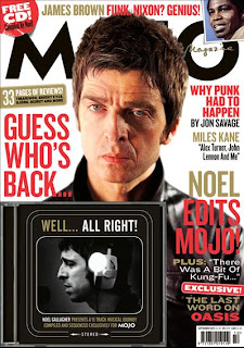
With every single edition of this magazine they include a cd of the featured artist, including a few of their tracks, straight away thats a selling point for the band because it makes the audience want to hear more if they like it enough. The magazine hope people with an interest in the 'rock n roll' genre will buy it. The artists name doesn't really stand out very much because it doesn't have to, Noel Gallagher has an extremely recognizable face for those interested in music and the magazine genre. So its common knowledge that the audience know who he is, making people want to read further. The magazine have been very clever whilst coming up with a photo for the cover, the message that his face gives me is 'you better buy this magazine as I didn't get interviewed for nothing', his face is the thing that makes you pick up the magazine. The artists/bands that MOJO uses gives the magazine the reputation that they take their music serouisly, and so they have to be careful when picking their artists as they want people with an amazing reputation.
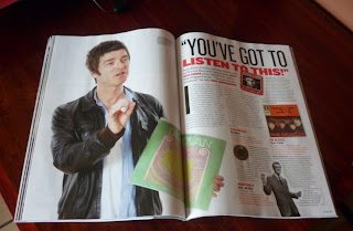
This is the inside interview feature of the magazine. It shows a different side to Noel, he seems more loosend up, more laid back, it seems as though he wants to do the interview he's more willing to do it, compared to the front cover. Instead of advertising his own music, he's talking about his favorite bands, advertising other peoples music.

With every single edition of this magazine they include a cd of the featured artist, including a few of their tracks, straight away thats a selling point for the band because it makes the audience want to hear more if they like it enough. The magazine hope people with an interest in the 'rock n roll' genre will buy it. The artists name doesn't really stand out very much because it doesn't have to, Noel Gallagher has an extremely recognizable face for those interested in music and the magazine genre. So its common knowledge that the audience know who he is, making people want to read further. The magazine have been very clever whilst coming up with a photo for the cover, the message that his face gives me is 'you better buy this magazine as I didn't get interviewed for nothing', his face is the thing that makes you pick up the magazine. The artists/bands that MOJO uses gives the magazine the reputation that they take their music serouisly, and so they have to be careful when picking their artists as they want people with an amazing reputation.

This is the inside interview feature of the magazine. It shows a different side to Noel, he seems more loosend up, more laid back, it seems as though he wants to do the interview he's more willing to do it, compared to the front cover. Instead of advertising his own music, he's talking about his favorite bands, advertising other peoples music.
Album Covers - Digipak reasearch
Most of the time album covers are relevant to the genre of music, but you can get random ones. The factors that make album covers different are the images, the font, the layout, and the colours. They create common ideolgies and opinions of the band or artist, letting you create your own opinion. They need to look interesting and appealing to the audience, to draw their attention, making it more likely they'll buy it.

The album name is placed along the top of the cd, it's not part of the cd. It relates to the image and the band, because at the time when the Clash where in their prime time, it was a time of racism. So it was a 'black market clash' against England. The font of the name is simple, because I think the band were trying to send out a message. The Clash is written in a destroyed kind of way, which could have connotations of social equality being destroyed at that time. The band wanted to combine both punk and reggae together, which they did very successfully and were also one of the first bands to ever do that. Even though the photos are real pictures, it has a cartoon effect about it. It was a time period of riots, so the cartoon likeness could be their idea of a joke towards civilization. The cover has connotations of the band having strong opinions towards the government and society, and if you know about the band members especially Joe St rummer you will also know that that's true. I think that its easy to identify a punk album, simply because somewhere on the album they will use bright, fluorescent colours, or they will use surrealist images. They've also shown that their not soley just punk, by putting the rastefarian on the front, it also shows they were not embarrased to be different and they enjoyed being experimental and individual. Not all punk album covers have messages on them, but this was a band all full of strong opinions, and rebellion against the government.
 As you can see this album cover is influenced by the genre. The obvious aspect would be the punk being the central image, it's got a scribbly look about it. The name looks like its spray painted, this has connotations of the band being rebellious. The slogan to me shows how the band has different sides to them, whether that be a difference in songs, or personality. The design of this album is another typical convention of the punk albums, having a black and white image with the name standing out in colour. On all of Rancid's other albums they've kept the style of the name exactly the same, with just a change in colour, they also keep the style of the images the same, they put a cartoon like effect on them. This gives the band their iconic image, making the albums and their image recognizable.
Subscribe to:
Posts (Atom)