
Thursday, 21 October 2010
Tuesday, 19 October 2010
Priliminary task Front Cover
 This is my front cover, you can see how i've changed my centeral main image, i've rotated and cropped it so that it looks straight. I've also changed the brightness so that the windows look brighter, and i put the stone wall into black and white. I went onto a website and downloaded some fonts so that the main text on the cover would stand out, i also think that it looks better, than the other standered fonts on photoshop. All the other images that i have on here i changed a bit so that they would look better, than from when i first took them. i just changed the brightness and contrast of all of them. The little small text is just photoshop font, because i didnt want it to stand out as much as the rest.
Before Picture

This is what my main central image looked like before i did anything to change it, it was really wonky and dull.
Tuesday, 12 October 2010

Friday, 1 October 2010
Magazine Cover
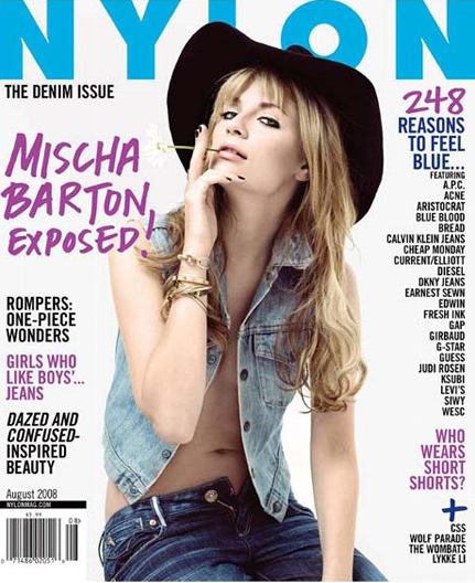
I like This one best out of the three, it looks different, it has its own look and seems like it doesnt look for others for insperation like all current fashion magazines, like heat, look etc. i really like the white on black font, and i like that it looks like theres a lot going on on the front cover, but if you look at each topic theres not actually loads of different topics, its just designed really well.
Thursday, 30 September 2010
Magazine Covers
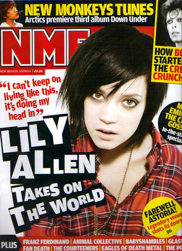
For this one less is definatly more. I really like the cenetral image and how it domiates the cover, the use of font that her name is written in goes with the image in the fact that she looks very rock'n' roll and untieded just like how the writing looks like it's been scribbled down. I also like how it stands out from the rest of the text on the cover, it gets straight to the point, it's one of the first things i looked at on the magazine. The thing that i dislike about this magazine is not the cover i love the way the cover's constructed but the fact that its a typical girl magazine and has problems etc. in the contents and its not really what i find interesting to read.
Magazine Covers
 I chose this cover for one of my insperation for my preliminary print task because i like how it has one main focused image, i also like the choice of font how basically its all the same colour(white) and how its all in the same font but in different sizes. I also admire how the centeral image (Dave Grohl) looks like its coming out of the page. Its in one way simple by the fact that theres not very many images, but then it crowds up the page by the text of all the different bands that are in the issue. There is nothing i dislike about this cover, I don't no wheather its because i really enjoy the magazine and i can't find fault or wheather it appeals to me because it has my interests in music.
Subscribe to:
Posts (Atom)