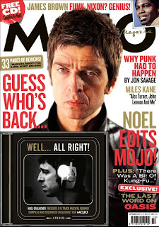
The type of magazine that I'd like our bands advertisment to be in, would appear in magazines such as Mojo or Q, they feature bands and have a style similar to ours. In order for bands to sell themselves and their albums they need to be advertised in the right places, where their supposed target audience are likely to look. So featuring in a magazine which is typical to the bands genre gives them a good chance of selling themselves to the right sort of people.
With every single edition of this magazine they include a cd of the featured artist, including a few of their tracks, straight away thats a selling point for the band because it makes the audience want to hear more if they like it enough. The magazine hope people with an interest in the 'rock n roll' genre will buy it. The artists name doesn't really stand out very much because it doesn't have to, Noel Gallagher has an extremely recognizable face for those interested in music and the magazine genre. So its common knowledge that the audience know who he is, making people want to read further. The magazine have been very clever whilst coming up with a photo for the cover, the message that his face gives me is 'you better buy this magazine as I didn't get interviewed for nothing', his face is the thing that makes you pick up the magazine. The artists/bands that MOJO uses gives the magazine the reputation that they take their music serouisly, and so they have to be careful when picking their artists as they want people with an amazing reputation.
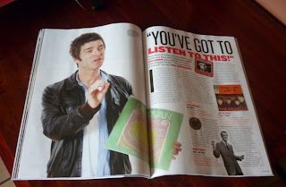
This is the inside interview feature of the magazine. It shows a different side to Noel, he seems more loosend up, more laid back, it seems as though he wants to do the interview he's more willing to do it, compared to the front cover. Instead of advertising his own music, he's talking about his favorite bands, advertising other peoples music.
Thursday 15 September 2011
Album Covers - Digipak reasearch
Most of the time album covers are relevant to the genre of music, but you can get random ones. The factors that make album covers different are the images, the font, the layout, and the colours. They create common ideolgies and opinions of the band or artist, letting you create your own opinion. They need to look interesting and appealing to the audience, to draw their attention, making it more likely they'll buy it.
The album name is placed along the top of the cd, it's not part of the cd. It relates to the image and the band, because at the time when the Clash where in their prime time, it was a time of racism. So it was a 'black market clash' against England. The font of the name is simple, because I think the band were trying to send out a message. The Clash is written in a destroyed kind of way, which could have connotations of social equality being destroyed at that time. The band wanted to combine both punk and reggae together, which they did very successfully and were also one of the first bands to ever do that. Even though the photos are real pictures, it has a cartoon effect about it. It was a time period of riots, so the cartoon likeness could be their idea of a joke towards civilization. The cover has connotations of the band having strong opinions towards the government and society, and if you know about the band members especially Joe St rummer you will also know that that's true. I think that its easy to identify a punk album, simply because somewhere on the album they will use bright, fluorescent colours, or they will use surrealist images. They've also shown that their not soley just punk, by putting the rastefarian on the front, it also shows they were not embarrased to be different and they enjoyed being experimental and individual. Not all punk album covers have messages on them, but this was a band all full of strong opinions, and rebellion against the government.
As you can see this album cover is influenced by the genre. The obvious aspect would be the punk being the central image, it's got a scribbly look about it. The name looks like its spray painted, this has connotations of the band being rebellious. The slogan to me shows how the band has different sides to them, whether that be a difference in songs, or personality. The design of this album is another typical convention of the punk albums, having a black and white image with the name standing out in colour. On all of Rancid's other albums they've kept the style of the name exactly the same, with just a change in colour, they also keep the style of the images the same, they put a cartoon like effect on them. This gives the band their iconic image, making the albums and their image recognizable.
Subscribe to:
Posts (Atom)