Tuesday, 7 December 2010

Magazine research


I have to decided to base the style of my magazine around MOJO. I have done this because it's the type of genre of music that I would like mine to be and also I really like the design of the magazine because each one has a different topic but still follows the same design.

Tuesday, 30 November 2010


This was a collage that i did last year when i created my magazine for GCSE. I would say that this collage follows mygenre of my magazine better than the other one I did. I prefer this one because it's more colourful, and I think just genrally does look better.

Monday, 29 November 2010

Planning Project

Why have you chosen print instead of moving image?
I have chosen to do print because I think that I will be better at it because I read lots of music magazines, and it interests me more than moving image.
Which skills will you need to demonstrate and develop in order to complete this project successfully? Think about technical skills as well as other personal skills.
I will need to use photoshop to get the best possible outcome because it's what all the magazines use to get the best out of there pictures. I will need to look at lots of other magazines so that I can make it look as professional as possible, I also need to organise my time so that I don't leave it to the end so that it ends up looking rushed.
What interest you about the magazines in the music industry?
I love the whole aspect of it, how people can express themselves through music and be who ever they want to be and not get judged. With magazines the ones that interests me are either music ones or ones like Nylon or things like that.
What genre of music are you interested in?
I like a bit of everything really except indie and all the mainstream rubbish on the radio. I like punk, ska, reggae and rock like the foo fighters.
Which magazines have you researched or are planning to research?
Q and MOJO are the main ones because they follow the same genre which i wish to follow for my magazine.
Which genre are you planning on producing your magazine for?
The music tastes that i said i liked are the ones that i want to include in my magazine, because then i think it will have a wider ranged audience
What is your intended audience?
It would probably be for older people because its the music that they were bought up around so maybe mid twenties to like mid 40's and there would be the odd exception so someone like me who would find it interesting.
What is the purpose of your magazine? which consumers will it meet?
It will be there to inform and entertain people about music.
List initial ideas for a title of your magazine? Your title needs to reflect/represent your genre.
.Fusion
.Addicted/Addict
.Fluorescent
.Solidarity
.Rebel
.Alternative/Alt

Wednesday, 24 November 2010

collage


This is a collage of fonts and images I found in magazines that I liked and ones which i think would fit the style and genre of my magazine.

Friday, 19 November 2010

Audience Profiling-Music Magazine

A typical consumer/reader of my magazine would have an interest in punk/rock/indie music so decent music.
I want the gender of my magazine to be intended for males and females. I would say the age would definitely vary because it all depends on what music your interested in but i would say typically about mid twenties to mid forties.
I think that there hobbies would be, playing instruments, watching films etc, and they would probaly spend there money on nights out, gigs, films and music.
What They Would Be Interested In
Tv channels- BBC3, E4, C4
Tv Programmes- Shameless, Skins, Misfits, Never mind the buzzcocks, This is England, Mightey Boosh.
Films-The Blues Brothers, Quadrophinia, Jackass, Dude where's my car?, Dukes of Hazzard.
Newspapers-The Sun
Magazines-Q, Mojo, Total Guitar
Internet Sites- Facebook, MySpace, Youtube
Radio Stations- Radio 2, JackFm, Nation,, Orginal
Musical Taste- Punk, Indie, Reggae,Ska, rock, Blues,

A typical consumer of my magaizne would expect the following needs to be met whilst reading my magazine.
Information and entertainment

A typical reader of my magazine would expect to see the following features on a double page spread.
Gig listing adverts, Interview

A typical reader of my magazine would want to expect the following types of people to be represented by individuals or groups within the magazine.
The readers of my magazine would not be mainstream, and i don't want them to be the type of people that enjoy chart music either, i want them to be punky.

Thursday, 18 November 2010

My Final Practise Advert

I changed my main image to black and white, then i changed the contrast because I feel that it looks better, then again i copyed the talk to frank sign and rubbed abit of the white away, it's not the best of pictures because it's not in focus, but it is something that i would imagine to see in a magazine.

Monday, 15 November 2010

My advert-emulation


This is the advert that I emulated, i took a picture of my friend in the same pose and changed it to black and white and then went on the filter gallery and chaged it like it was done on the original advert, and then on the colour background, I found a picture off the interent and again photoshopped it so that it would look more like the orginal. i then copyed the talk to frank sign off it, and rubbed some of the white off.

Thursday, 4 November 2010

advertisment - ideas and thoughts


My task is to emulate a advert for a charity, so i can later on make one for my magazine. I have chosen talk to Frank because its a charity that relates into our age group so when i create my magaizne it will in with my target audience. The reason why I have chosen to emulate this one is because it's bright so people are more likley to pay attention to it, It's simple but effective. It's a rememorable because it's so bright and different, compared to all the other charity adverts where there there to shock you, this is just simple staright to the point 'need help with drugs talk to frank' thats the only text they have on here. It also has a famous character on it Frank Gallagher from shameless, he is your typical druggie and drunk, and if you watch the programme he's a state so hopefully people will avoid wanting to be like that.

Tuesday, 19 October 2010

Priliminary task Front Cover

This is my front cover, you can see how i've changed my centeral main image, i've rotated and cropped it so that it looks straight. I've also changed the brightness so that the windows look brighter, and i put the stone wall into black and white. I went onto a website and downloaded some fonts so that the main text on the cover would stand out, i also think that it looks better, than the other standered fonts on photoshop. All the other images that i have on here i changed a bit so that they would look better, than from when i first took them. i just changed the brightness and contrast of all of them. The little small text is just photoshop font, because i didnt want it to stand out as much as the rest.

Before Picture


This is what my main central image looked like before i did anything to change it, it was really wonky and dull.

Friday, 1 October 2010

Magazine Cover


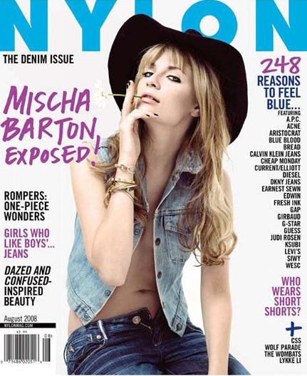
I like This one best out of the three, it looks different, it has its own look and seems like it doesnt look for others for insperation like all current fashion magazines, like heat, look etc. i really like the white on black font, and i like that it looks like theres a lot going on on the front cover, but if you look at each topic theres not actually loads of different topics, its just designed really well.

Thursday, 30 September 2010

Magazine Covers


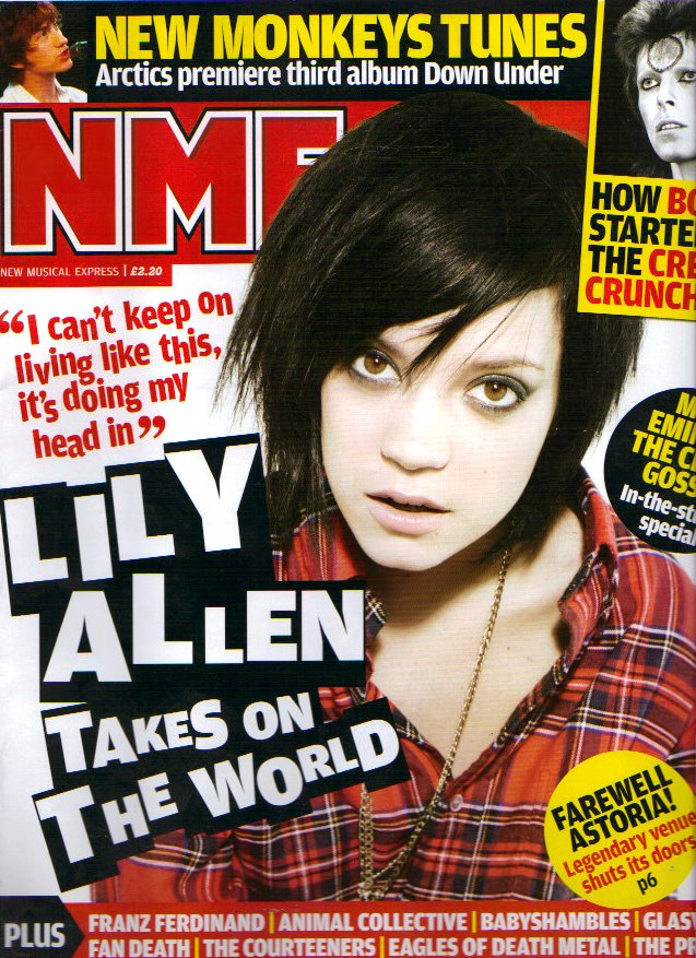
For this one less is definatly more. I really like the cenetral image and how it domiates the cover, the use of font that her name is written in goes with the image in the fact that she looks very rock'n' roll and untieded just like how the writing looks like it's been scribbled down. I also like how it stands out from the rest of the text on the cover, it gets straight to the point, it's one of the first things i looked at on the magazine. The thing that i dislike about this magazine is not the cover i love the way the cover's constructed but the fact that its a typical girl magazine and has problems etc. in the contents and its not really what i find interesting to read.

Magazine Covers

I chose this cover for one of my insperation for my preliminary print task because i like how it has one main focused image, i also like the choice of font how basically its all the same colour(white) and how its all in the same font but in different sizes. I also admire how the centeral image (Dave Grohl) looks like its coming out of the page. Its in one way simple by the fact that theres not very many images, but then it crowds up the page by the text of all the different bands that are in the issue. There is nothing i dislike about this cover, I don't no wheather its because i really enjoy the magazine and i can't find fault or wheather it appeals to me because it has my interests in music.

Sunday, 18 July 2010

My names Leah Baber, i'm in year 12 of chew valley sixth form. I have chosen to do media this year because i find it really interesting, also i use a lot of media and enjoy it so it seemed like a good subject to do. I chose to do it for GCSE and i got on really well with it aswell. I do prefer and really enjoy the pratical side to it, because it's how you can express yourself, and get out your own ideas.

I use a lot of the media, i really enjoy watching films and reading magazines, listining to music, i also use the internet for social networking. I like watching short series programmes on T.V. so things like This is England, and Shameless, skins, Inbetweeners etc. and i like to read music magazines more than fashion ones because i find them more interesting, and i also find that they fit my personalilty more.

I obviously use lots more media in my everyday life such as listining to the radio, reading a newspaper etc. We use the media every single day without even realising, that is why i find it so interesting and have decided to study it further.