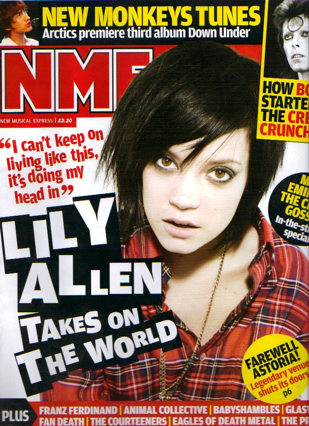
I like This one best out of the three, it looks different, it has its own look and seems like it doesnt look for others for insperation like all current fashion magazines, like heat, look etc. i really like the white on black font, and i like that it looks like theres a lot going on on the front cover, but if you look at each topic theres not actually loads of different topics, its just designed really well.
No comments:
Post a Comment