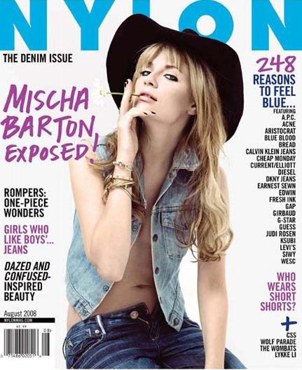
For this one less is definatly more. I really like the cenetral image and how it domiates the cover, the use of font that her name is written in goes with the image in the fact that she looks very rock'n' roll and untieded just like how the writing looks like it's been scribbled down. I also like how it stands out from the rest of the text on the cover, it gets straight to the point, it's one of the first things i looked at on the magazine. The thing that i dislike about this magazine is not the cover i love the way the cover's constructed but the fact that its a typical girl magazine and has problems etc. in the contents and its not really what i find interesting to read.
No comments:
Post a Comment